WordPress · Design implementation
Solon Family Dental
Scalable WordPress Build
Translated a polished design direction into a cohesive WordPress system spanning dozens of pages, reusable layouts, and carefully adapted responsive behavior.
01 · Overview
Scale the design, not the inconsistencies.
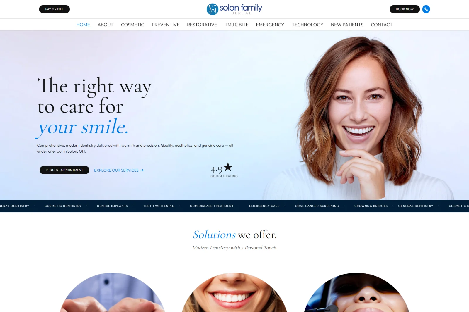
Solon Family Dental was a large WordPress build based on an established visual direction. I implemented the homepage and extended its typography, spacing, card systems, and content patterns across approximately 35 pages within WPBakery and the agency’s custom theme.
02 · The challenge
Keep thirty-five pages feeling like one site.
The site included doctors, team members, services, testimonials, long-form educational content, forms, and conversion sections. Each content type needed a distinct presentation, but page-by-page improvisation would have created visual drift and made responsive behavior difficult to maintain.
03 · What I built
Build patterns that can travel.
I created repeatable WPBakery structures for doctor profiles, team layouts, service pages, testimonial cards, calls to action, and long-form content. I reused shared classes and layout conventions across the site and adapted each pattern deliberately for desktop, tablet, and mobile instead of relying only on the builder’s default stacking.
04 · Result
A large site with a shared visual language.
The finished build maintained the quality and character of the original design across dozens of routes and content types. It also helped reveal recurring interface needs, including long-page navigation patterns that later informed reusable components in Cairn.
Selected build evidence
One visual language, carried across a large site.
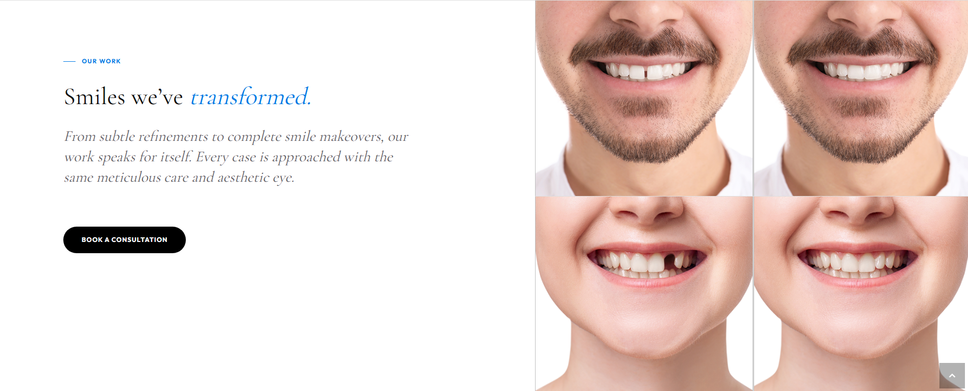
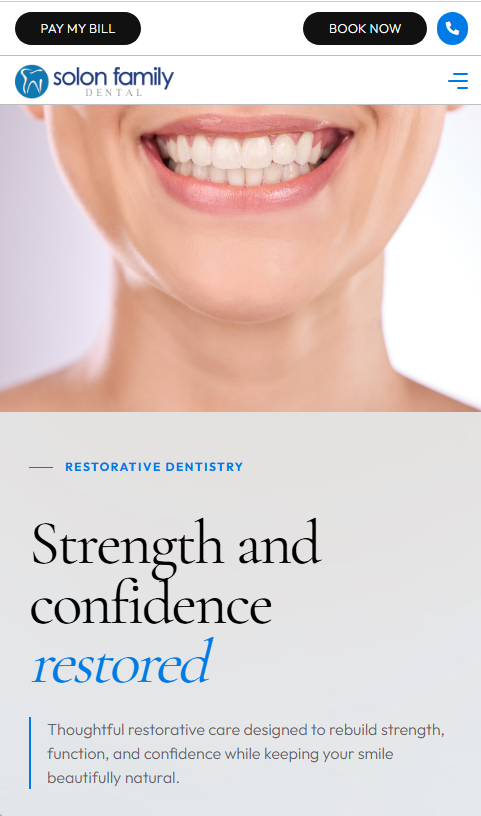
Homepage direction, responsive navigation, reusable service cards, and flexible content patterns from the finished WordPress build.
01 · Design translation
Establish the visual language at full scale.
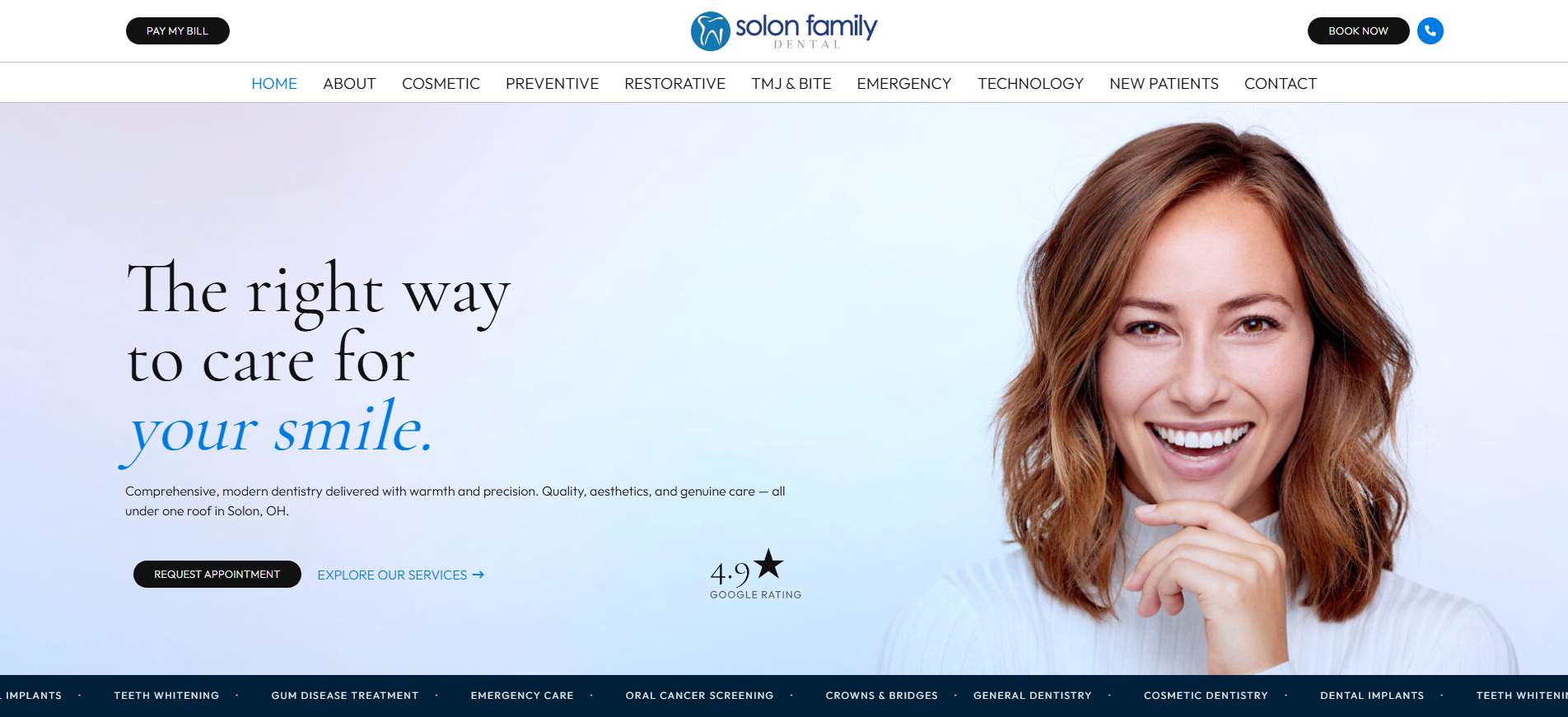
The homepage turns the supplied direction into a complete desktop composition, while the mobile navigation preserves access to a broad service structure without crowding the smaller header.
02 · Reusable service system
Let one card pattern travel across breakpoints.
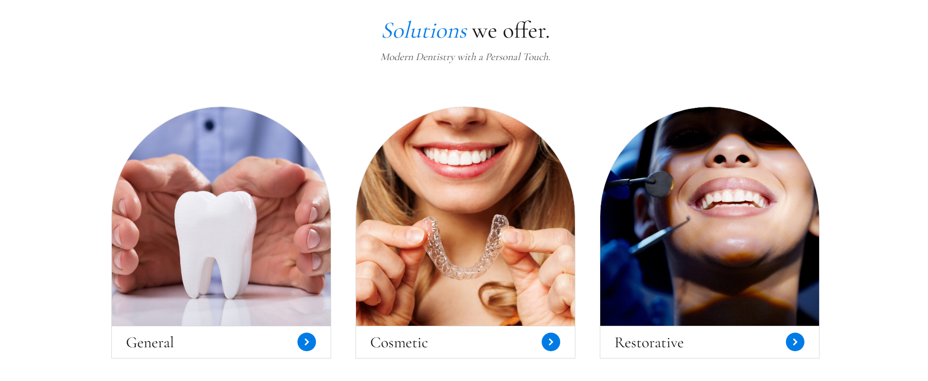
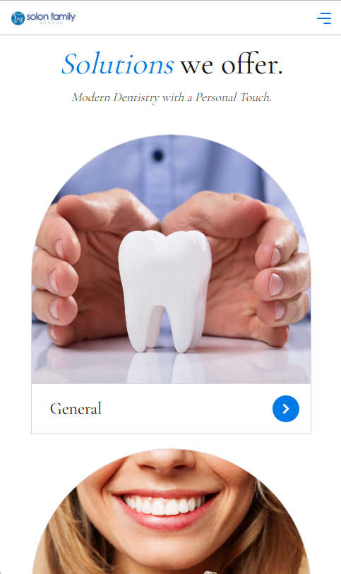
The service overview uses a repeatable image-and-label pattern that reads as a balanced row on desktop and a deliberate vertical sequence on mobile.
03 · Flexible content patterns
Carry the design beyond the homepage.
Promotional storytelling and long-form service content use different compositions while sharing the same editorial type, blue accents, restrained controls, and responsive spacing.